
UI/UX Micro-Interactions That Make Products Feel Premium
Micro-interactions are what separate premium apps from functional ones. Here are the patterns that matter — feedback, loading, transitions, easing, and reduced-motion — and how to design them well.
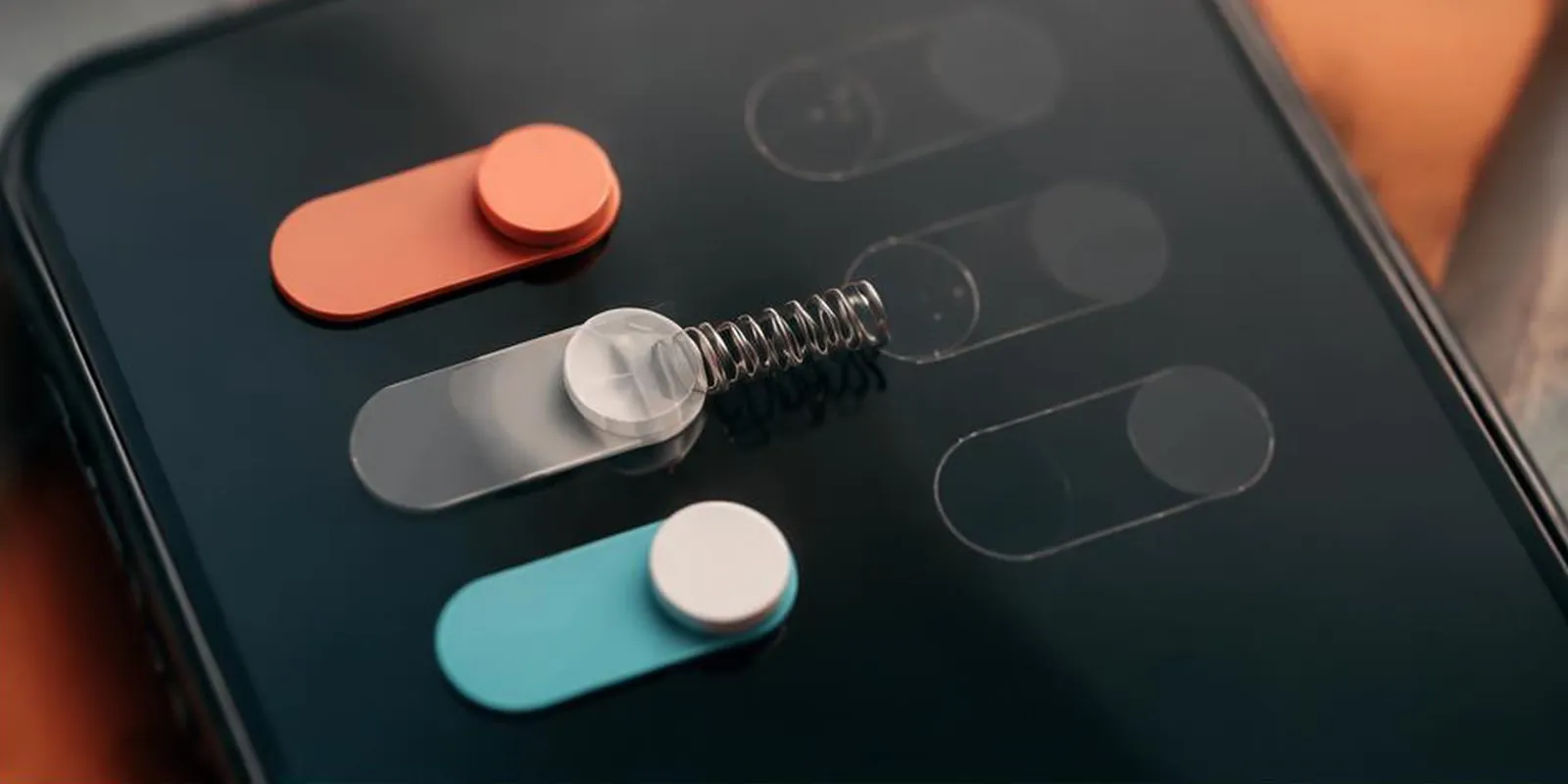
Two apps can have the same features, the same layout, and the same price. One feels premium. One feels cheap. The difference is often micro-interactions — the small moments of motion that tell users the app cares.
This post covers what micro-interactions actually are, which ones matter most, and how to design them well.
What micro-interactions are
Micro-interactions are small animations that respond to user actions:
Button press feedback
Loading indicators
Toggle switches
Success/error confirmations
Hover states
Scroll-triggered reveals
Page transitions
They're invisible when done well. They're painfully obvious when done poorly.
The five categories that matter
1. Feedback — Immediate response to user input
Button press (scale down 2%)
Toggle switch (animated slide)
Form input (focus ring, valid/invalid states)
Checkbox (animated check)
Feedback tells users "I heard you." Without it, apps feel unresponsive.
2. Loading — Setting expectations
Skeleton screens (better than spinners)
Progress bars (for known durations)
Optimistic UI (show result before server confirms)
Indeterminate spinners (last resort)
Loading animations should inform, not distract. Skeletons beat spinners because they show the shape of what's coming.
3. Transitions — Moving between states
Page transitions (fade, slide)
Modal entrance/exit
List item reorder
Accordion expand/collapse
Transitions maintain spatial context. A user should always know where they came from and where they're going.
4. Success/error — Confirming outcome
Green checkmark on save
Red shake on invalid input
Toast notifications
Inline validation
Success and error states should be instant, clear, and respectful (never patronizing).
5. Ambient — Background delight
Subtle pulsing on live data
Animated background gradients
Progress rings
Confetti on milestones (sparingly)
Ambient motion should be nearly imperceptible — felt, not seen.
Easing — the secret ingredient
Motion that uses linear easing feels robotic. Real motion accelerates and decelerates.
Ease-out — Fast start, slow end. Best for elements entering.
Ease-in — Slow start, fast end. Best for elements exiting.
Ease-in-out — Slow start, slow end. Best for transitions between states.
Custom cubic-bezier — For brand-specific motion.
Standard durations: 150ms (small), 250ms (medium), 400ms (large).
Reduced motion
Some users experience motion sickness or cognitive overload. Respect prefers-reduced-motion:
Replace sliding with fades
Replace scale with opacity
Remove ambient motion entirely
Keep essential feedback (buttons still respond)
This is a WCAG requirement, not a nicety.
Tools
Figma + Figma Smart Animate — Design micro-interactions
Lottie — Render JSON animations in web and mobile
Framer Motion — React animation library
GSAP — Advanced web animation
CSS transitions + keyframes — For simple cases
Common mistakes
Animating everything (motion fatigue)
Linear easing (feels robotic)
Too long (>400ms feels slow)
Ignoring prefers-reduced-motion
Motion without meaning (animation for its own sake)
Inconsistent timing across the app
Key takeaways
- Micro-interactions separate premium apps from functional ones
- Five categories: feedback, loading, transitions, success/error, ambient
- Easing matters more than duration
- Respect prefers-reduced-motion (WCAG requirement)
- Motion should have meaning, not just style
Further reading
About the author
Senior Motion Designer →Senior Motion Designer · Quality Assurance Labs